Challenge

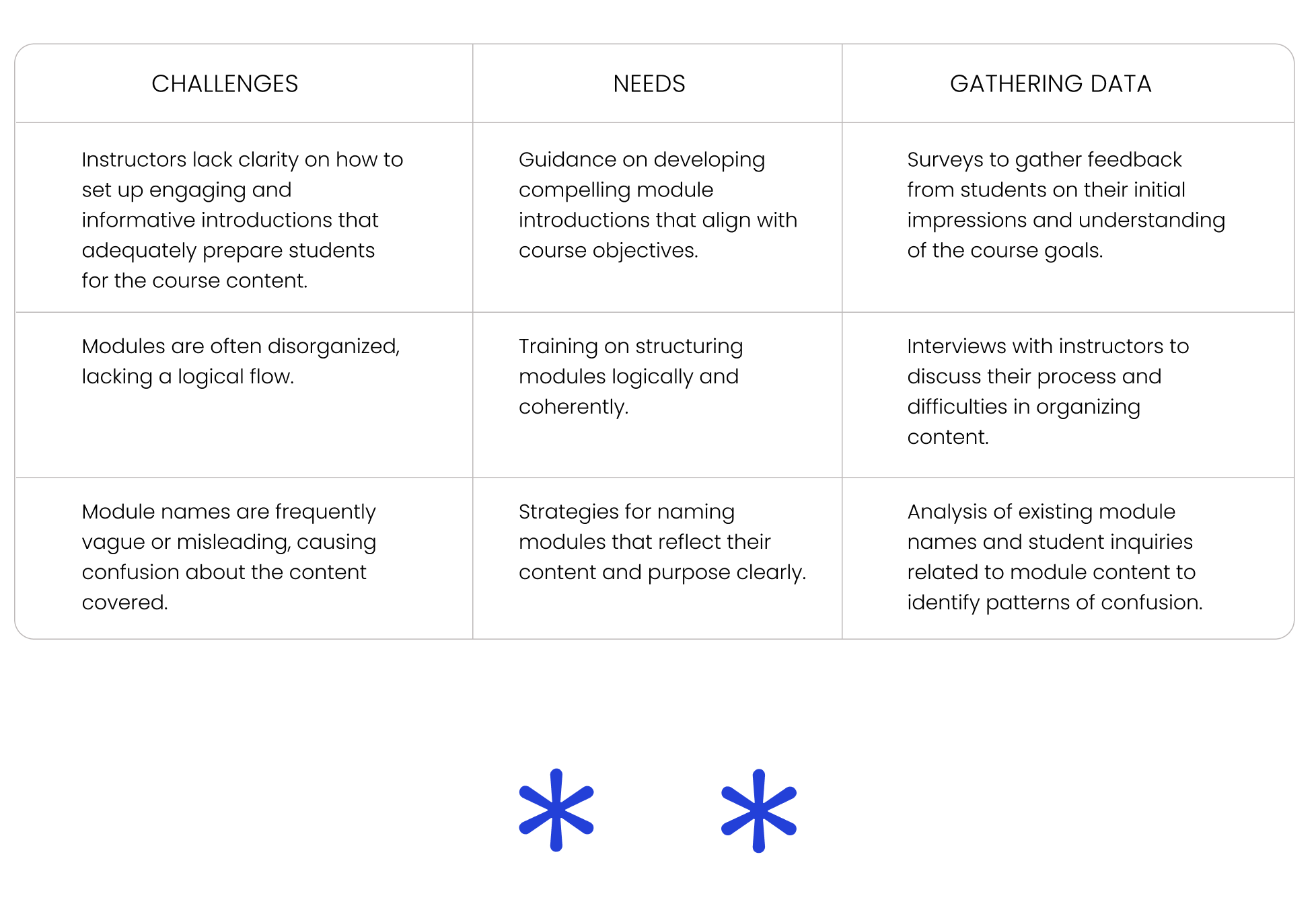
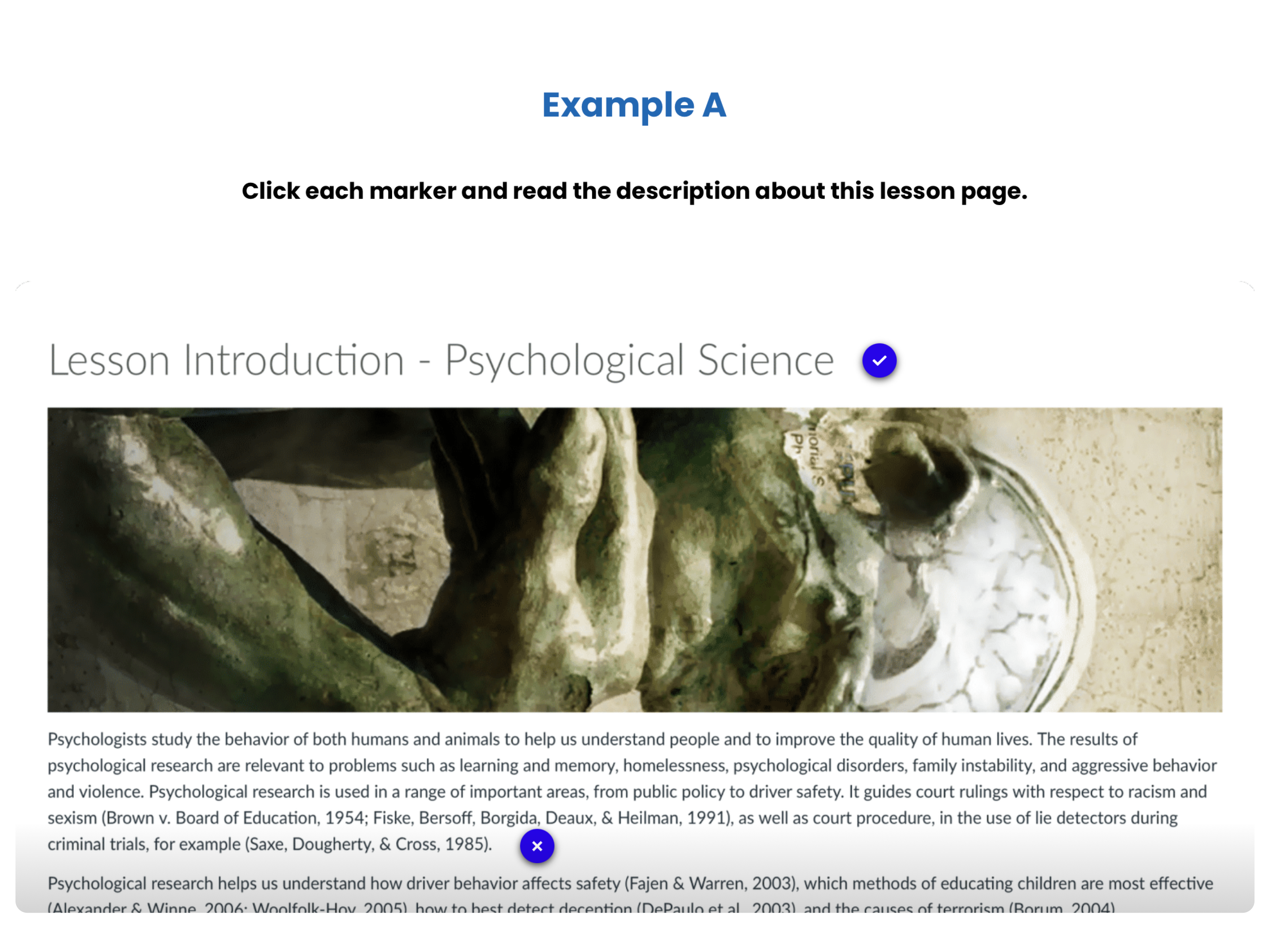
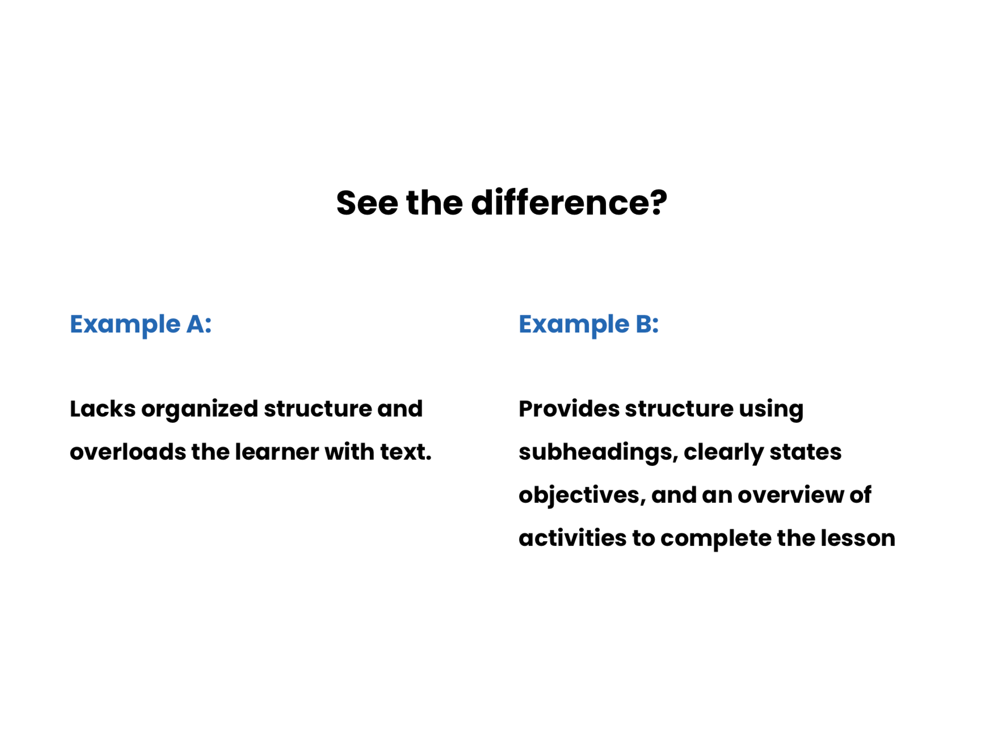
Instructors struggle with creating organized and clearly structured online modules in Canvas LMS. This often leads to inadequate introductory modules that fail to provide a comprehensive overview of the course. Disorganized page structures make it difficult for students to navigate and find essential information.

Solution

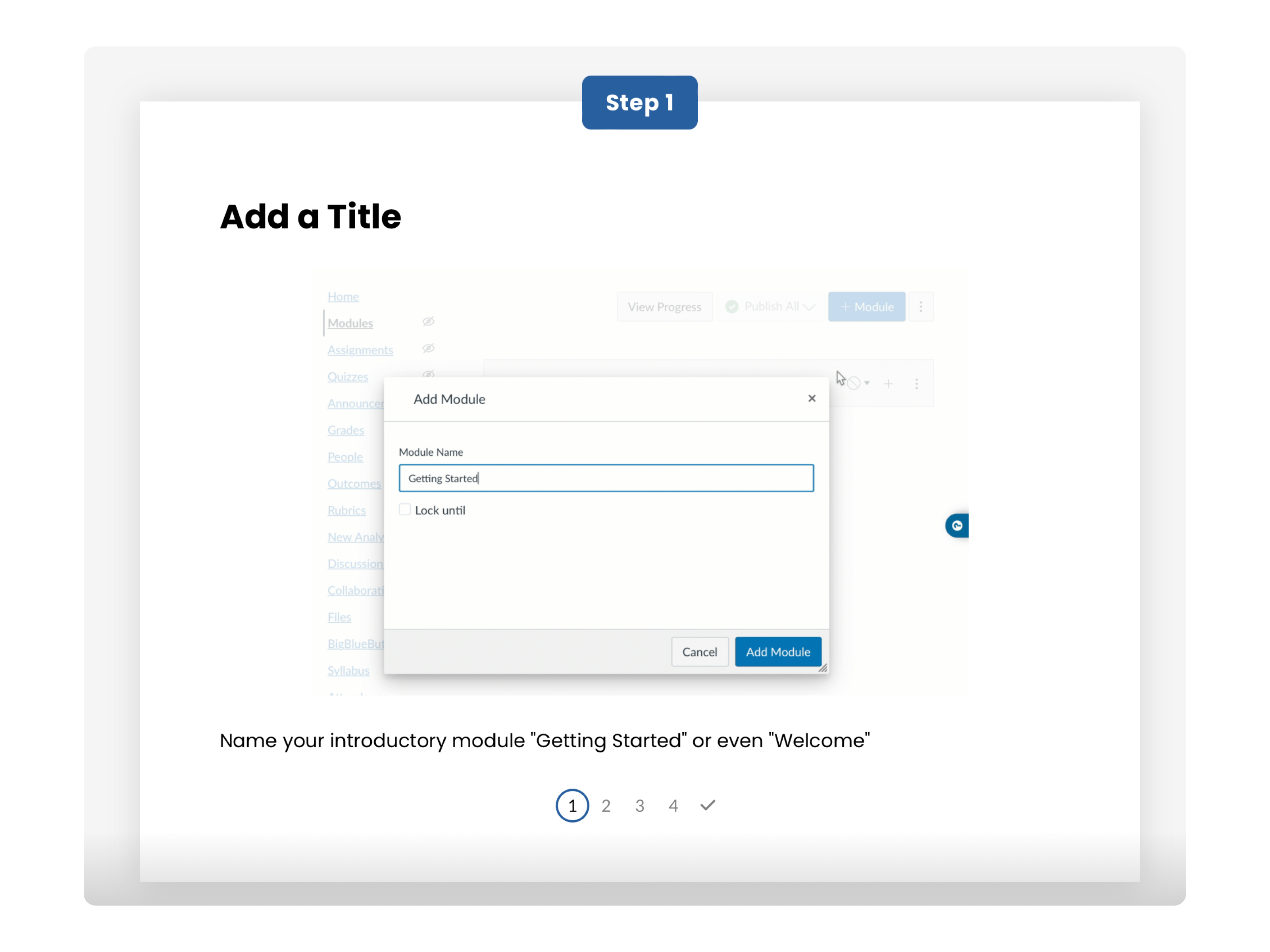
Develop an online guide using a series of screen-recorded examples and step-by-step instructions:

  • Break the guide into manageable sections that focuses on specific features.

  • Visually show step-by-step processes directly from the software helps learners see exactly what they need to do.

  • Use zoom in and zoom out to draw attention to important buttons, fields, and functions during the screen recording.

  • Include the Course Design Evaluation Checklist by Canvas for additional support material.

My Role

  • Conduct a needs analysis on instructors who struggle in organizing course structure to better understand knowledge or skill gaps.

  • Define learning objectives using measurable and observable activities.

  • Determine an appropriate delivery method based on instructors' needs.

  • Optimize screen-recorded file sizes for Articulate Rise and learners' browser capabitilities to reduce performance issues.
  • Conduct performance tests to mitigate technical issues that might impact the instructor's learning experience.

  • Evaluate the effectiveness of the guide based on quantitative insights in engagement with the online guide and qualitatitive feedback from instructors.

Impact

  • Instructors will be equipped with technical knowledge and improve their skills in developing effective modules by following the screen-recorded examples.
  • Courses in Canvas LMS will be better structured and less frustrating for students to navigate course material.

  • Canvas LMS analytics will be able to provide student engagement metrics which will also assess the effectiveness of the guide.

Reflection

I enjoyed developing the instructional content for this project because I think screen recordings help explanations come alive. This approach helps learners see the steps in action and makes the learning process more intuitive.

Also, I've noticed a bit of a hurdle with the fixed sizes of the content blocks for interactive elements. The Articulate authoring platform’s ease of use is great, but these size constraints can sometimes limit how we present complex interactions or detailed info. It’s been a bit of a balancing act, figuring out creative ways to work within these limits while still keeping the courses engaging and informative.

Project information

  • Software: Articulate Rise 360, Camtasia
  • Category: Learner Support Material
  • Est. Completion Time: 20 minutes